
Case study: Data distributions

“There was a pattern, with disturbances. An orderly disorder”
Glieck, J 1987. Chaos: The Amazing Science of the unpredictable. London: Penguin Random House
Written by J.K Penhaul Smith (Co-founding Director)
We have spent time looking at the data associated with teams and clubs, including a little theory of ways we may use and analyse these data. However, there is a scale at which we have yet to discuss, which will draw together these factors into a bigger picture than a single club. As we have established, everything is affected by the different things that are happening in the surrounding area, be that population changes, funding alterations or local legislation. These factors also combine at a larger scale, so we can see whole sections of the sport heavily impacted by factors which might not be obvious when looking at a single club.
For example, how many members does the average sailing club have?
How might this affect the actions of governing bodies?
How do we determine the average number of members?
If we were to do a survey of approximately 50 sailing clubs in the UK and ask them how many members they had, this would give us a small sample, which would be useful to inform large scale data collection efforts (include link to attached data).
From here we now need to understand what we mean by average. There are three different ways to determine an average of a data set, which are commonly used. These are Mean, Median and Mode (here).
Which one is more useful is going to depend upon the data set, specifically its distribution. An easy way to look at the distribution of the data is to plot it using a histogram (Fig: 1). This figure, made in Excel, counts every time a data point fits into a specific category (called a bin).
For example, if a new sailing club had 45 members, then the frequency of our data points between 42-63 would increase by 1. If another sailing club were added which had 100 members, then the frequency would increase by 1 in the bin of 83-104 members. Alternatively, if we added a third sailing club with 200 members, we would need a new bin, which contained the frequency that sailing clubs in our data set had greater than 104 members.

Fig 1: Membership numbers of our hypothetical group of sailing clubs
So why does this affect which average we chose?
The distribution of our data looks approximately symmetrical and forms a shape similar to the letter n, which suggests that the data is approximately normally distributed. What do we mean by that? If data is normally distributed then we will see a distribution plot that looks a lot like this and the mean, median and mode of data will be very similar, if not the same (mean= 51, mode= 52 and median= 56 members, so very close, but not exact). We can actually use a range of different statistical tests to determine if the data is normally distributed, which might be appropriate if we are making decisions based on these data.
Because our data is normally distributed, we can report the mean number of members of our group of sailing clubs, and we should also report the standard deviation of the mean. We report the standard deviation because mathematically speaking +/- a single standard deviation of our mean, for a normally distributed data set, will include the vast majority of the data in our data set (34.1% of our data which is above the mean and the same amount below it). This is why we have previously said that if our error bars of our standard deviations do not overlap (link) then the two data sets are likely be significantly different, even if we cannot say for certain without performing an appropriate statistical test.
Other patterns of distribution
The challenge that we have is that not all data is normally distributed. Any distribution pattern may occur that we can possibly imagine, as well as virtually infinite number that we have not yet imagined. So, if we do not check the distribution of our data, then we may make decisions that are influenced by the headline statistics, rather than the actual population data.
For example, it is very common when looking at the counting of individuals in a population for the data to be better described by a Poisson distribution (Fig: 2). As a result, because our data is skewed towards the low numbers, our mean is influenced by the small number of very large sailing clubs, while the median and mode more accurately represent the greater number of smaller sailing clubs (mean= 50, mode= 37, median= 47). Because of this the standard deviation around the mean is much greater, because there is much more variability in the data (standard deviation= 31 people). If we make decisions based on the mean number of people in a sailing club, without understanding this variability in the data, we are likely to be catering for the small number of larger sailing clubs, not the more common smaller sailing clubs.

Fig 2: An example of a Poisson distribution histogram
These changes in the data distribution can become even more extreme, with another example of this being data that conforms to a Pareto Distribution (Fig: 3). In this distribution, 80% of the data is made up of the first 20% of the population, while the remaining 80% of the sailing clubs only make up 20% of the data. Therefore, our mean is influenced by the small number of large sailing clubs, as well as our median, while the mode represents the most common size of sailing club (mean= 43, mode= 6, median= 40), while our standard deviation represents the even greater variability in the data (standard deviation= 38).
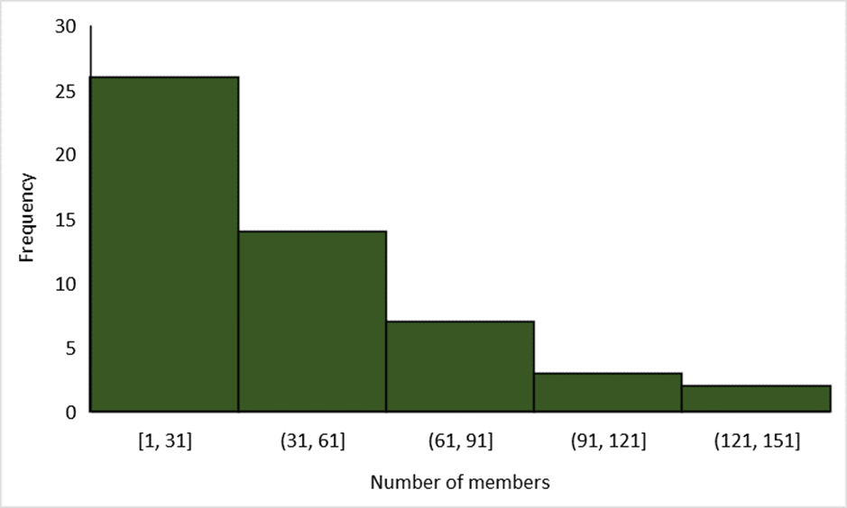
Figure 3: An example of a Pareto distribution histogram
If we do not represent this data distribution, then just using the headline statistics to inform our decision making will potentially negatively impact our interventions. For example, if we knew that the sailings clubs in our local area had a mean number of 50 sailors and targeted our support to clubs which had fewer than 50 members, this support may be required by more clubs than we anticipate if our group of sailing clubs has a Poisson or Pareto style distribution, rather than a normal distribution.
Data distribution in reality
An example of a skewed distribution of population data, is the number of members of university sailing clubs in the UK. If we look at the data on the state of the sport in 2019, we can see use these data to look at things which might not be obvious without a big picture view (link to files below).
Sailing at university occurs at 53 universities (in 2019). University clubs are much smaller than ordinary sailing clubs (mean= 52, mode= 37, median= 45, Fig: 4) and we can suggest that the distribution of the population data conforms more closely to a Poisson distribution, than normal distribution.

Fig 4: Distribution of the population of University Sailing Clubs. Adapted from Penhaul Smith et al., 2019.
Given that a large number of sailing clubs were struggling financially at the time, it could be suggested that the size of club, might be correlated with how well the club was doing financially, although this was not investigated as part of the report from which these data was drawn. If we understood this, then interventions which increased the stable number of members in a university sailing club might have a disproportionate improvement upon the finances of these university sailing clubs.
Conclusion
In this blog post we looked at the challenges faced by dealing with larger scale population data and how data distribution might influence our choice of average to report. Once we look at the distribution of the data, this might impact how we targeted our intervention(s) to impact these populations.
Data for preparing the figures is here: population distribution data
Report cited: Penhaul Smith et al., 2019